
OThe Challenge
The road signage industry is crowded with lookalike brands: the same stylized road, the same visual clichés repeated from one company to the next. Minasul didn’t need another generic brand competing for attention with a sea of companies that all look the same.
The Concept
O próprio cliente sugeriu o óbvio: um “S” em forma de estrada. Fazia sentido na lógica, mas não fazia sentido pra diferenciar a marca de ninguém. Escolhemos não fazer.
The standard became something else: instead of illustrating the industry, we built around exclusivity, technical expertise, and reliability, the values that truly sustain Minasul every day. Safety and punctuality don’t need a road illustration to be felt. They need a brand that looks serious enough to trust.
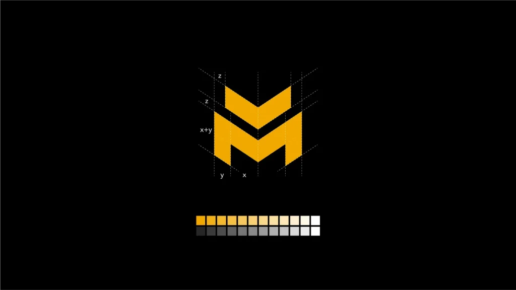
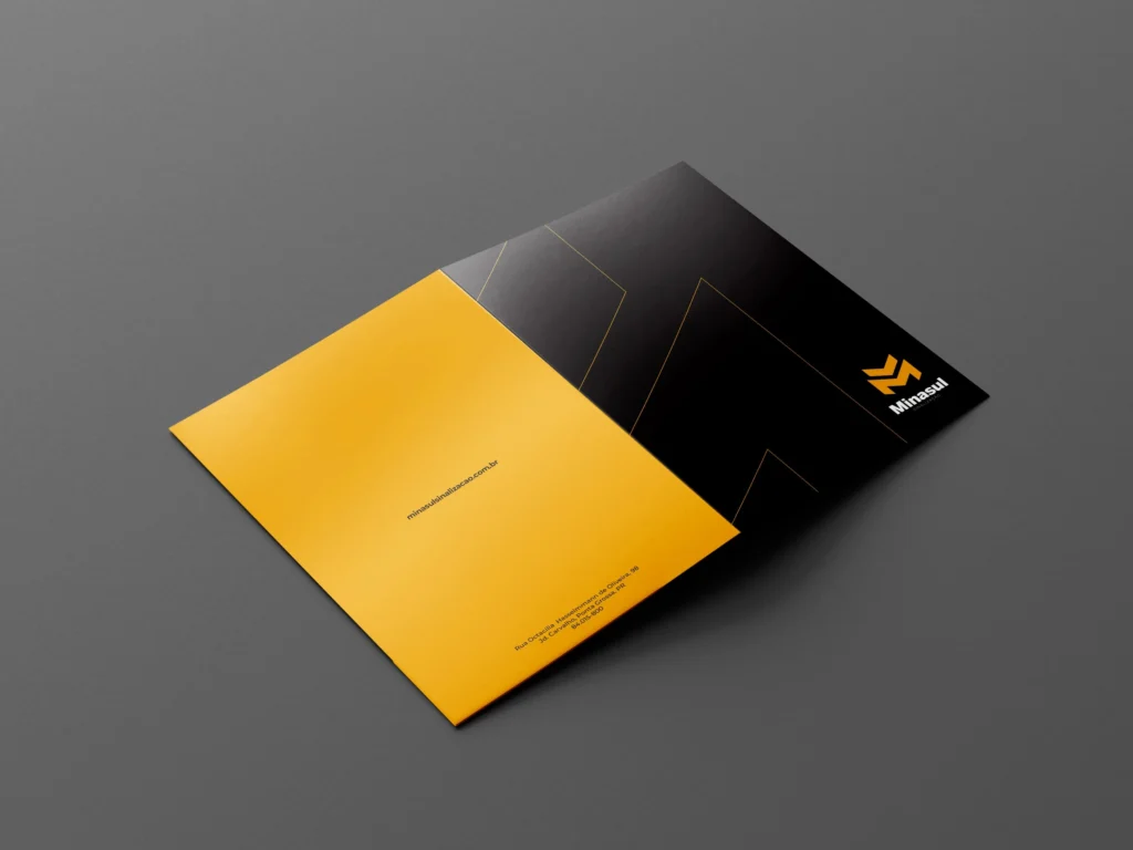
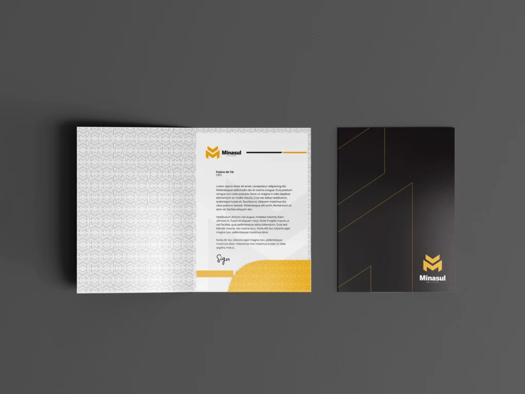
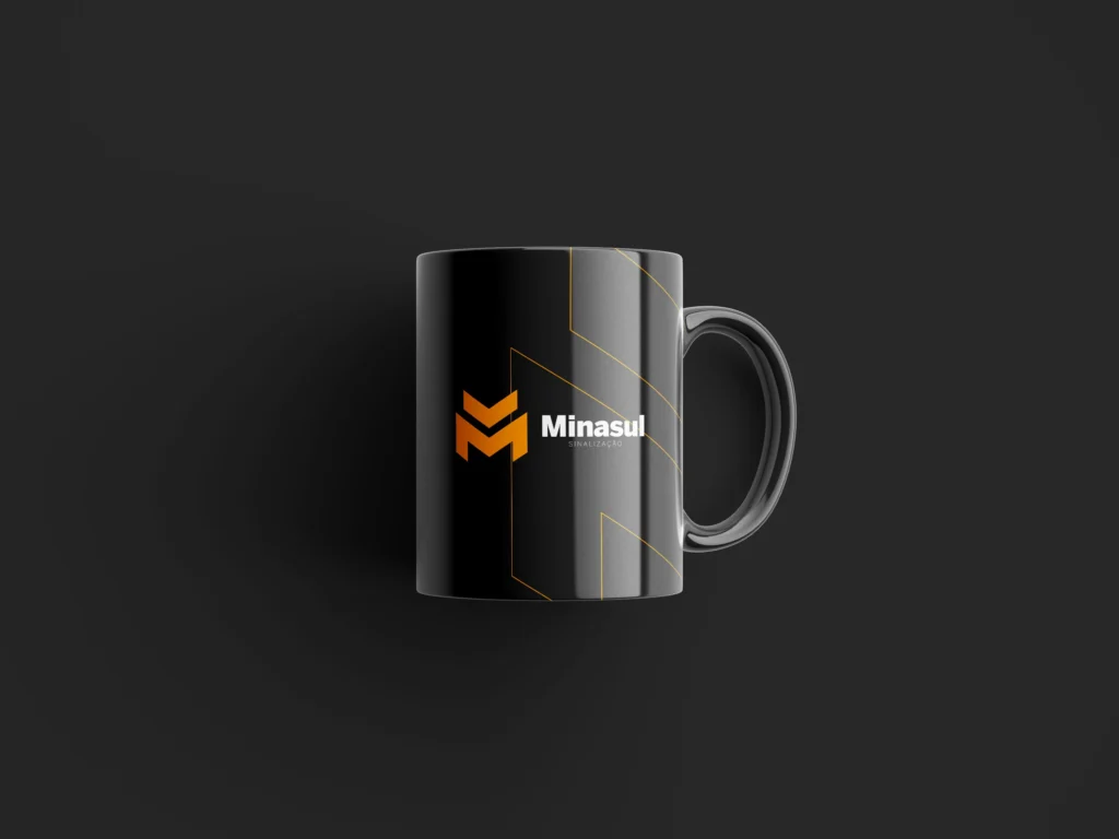
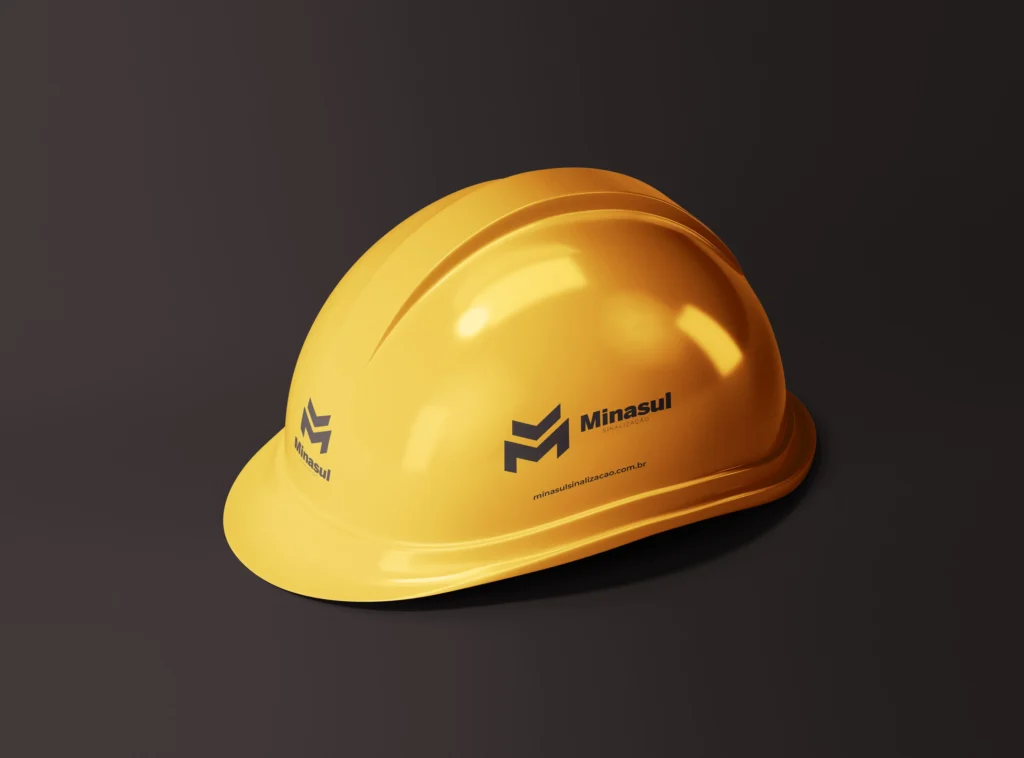
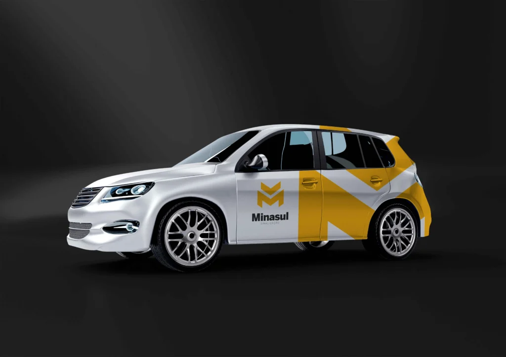
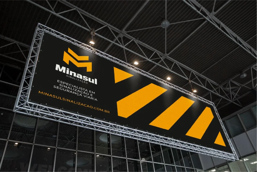
Yellow and black make a bold statement: strong color, striking presence, and a brand that doesn’t go unnoticed. Modern, bold, and committed to continuous improvement rather than repeating the same formula as everyone else.
Different for a reason. Different because the obvious was already saturated.
What We Delivered
- Visual Identity
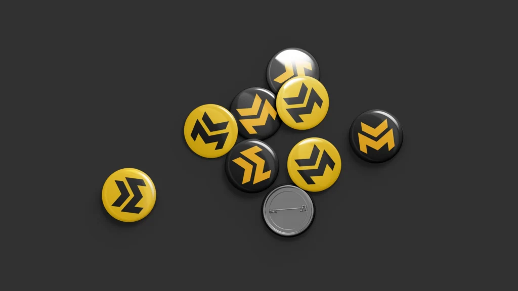
- Logo and symbol
- Color Palette
- Typography
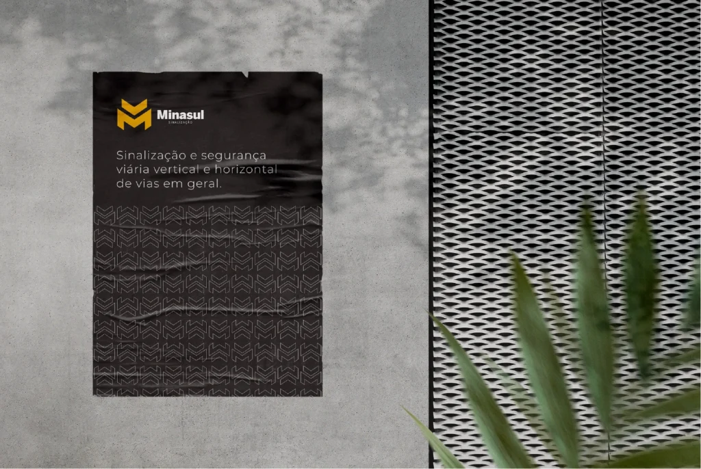
- Supporting Graphic Elements
- Application Guidelines
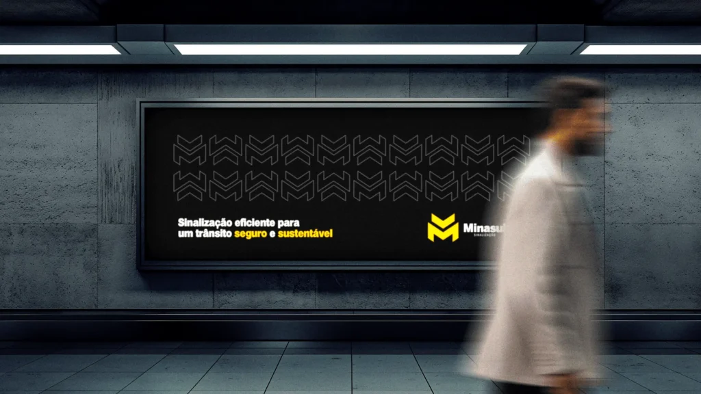
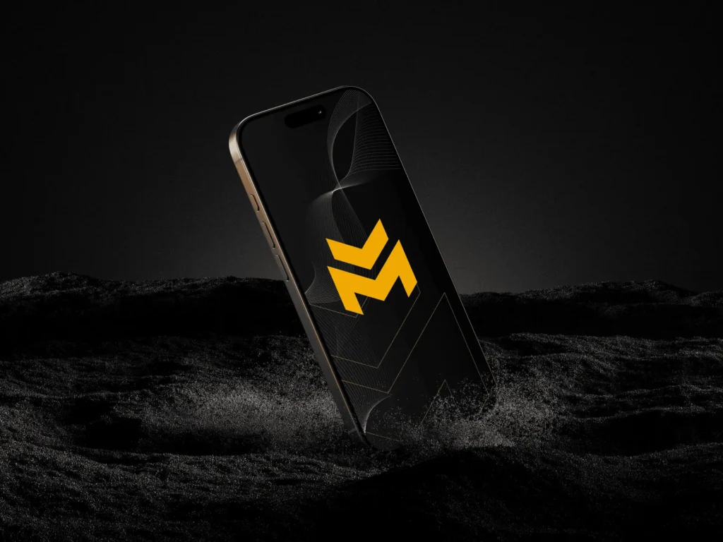
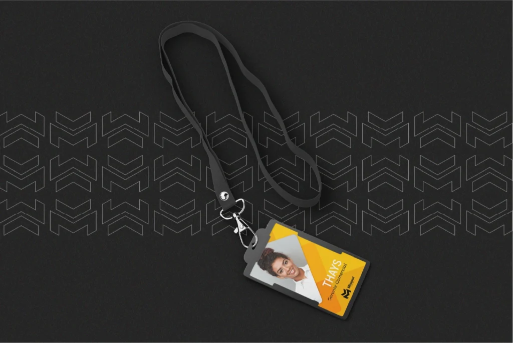
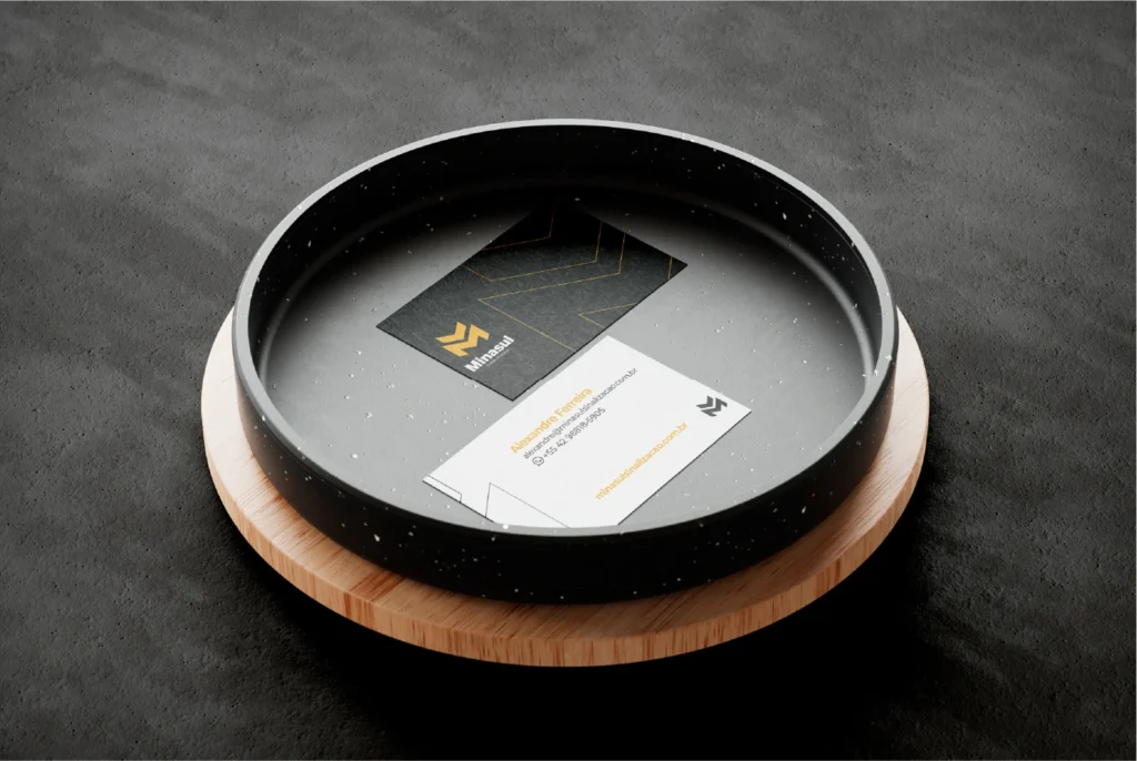
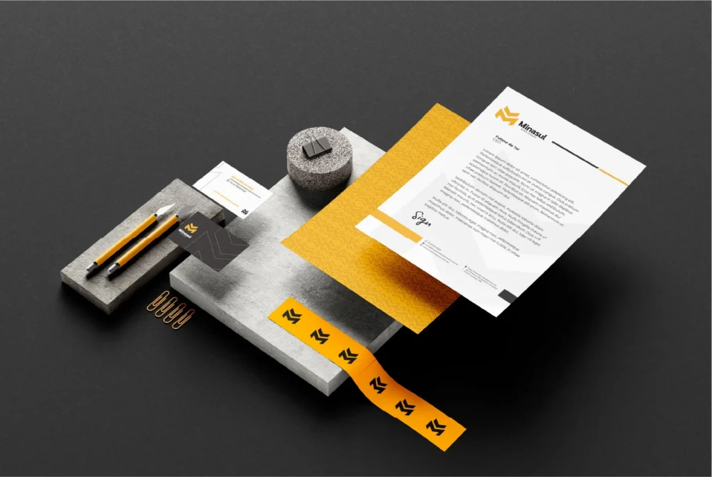
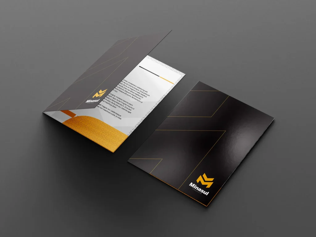
- Branded Materials and Communication Assets
The result: a brand that looks like no other in the industry, and that’s exactly why it works.