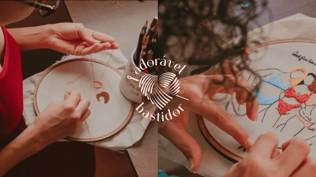
Freehand embroidery isn’t an off-the-shelf product. It’s handmade work, stitch by stitch, shaped by time that can’t be rushed. The brand needed to communicate that without forced embellishment or generic craft aesthetics. The challenge was easy to get wrong and hard to get right: to feel delicate without feeling fragile, poetic without becoming empty decoration.
The Concept
The standard was different here: every embroidered piece is truly unique. No two are alike, and there’s no mass production disguised as handmade work. The identity needed to carry that weight: authenticity that doesn’t need to be explained, only felt.
That’s why the lines are fine and the gestures restrained. Nothing excessive. The aesthetic follows the same logic as a well-crafted piece of embroidery: delicate, yet intentional in every line. It’s visual poetry, not pretty decoration. Every detail exists because it means something, not simply to fill space.
A brand that respects the quietness of handmade work without needing to shout to be noticed.
Usamos cookies para melhorar sua experiência por aqui. Ao continuar, você concorda com o uso deles.
Funcional
Always active
O armazenamento ou acesso técnico é estritamente necessário para o objetivo legítimo de permitir o uso de um serviço específico explicitamente solicitado pelo assinante ou usuário, ou para o único objetivo de realizar a transmissão de uma comunicação por uma rede de comunicações eletrônicas.
Preferências
O armazenamento ou acesso técnico é necessário para o objetivo legítimo de armazenar preferências que não são solicitadas pelo assinante ou usuário.
Estatísticas
O armazenamento técnico ou o acesso que é usado exclusivamente com objetivos de estatística.O armazenamento ou acesso técnico que é usado exclusivamente para fins de estatísticas anônimas. Sem uma intimação, conformidade voluntária do seu provedor de serviços de internet ou registros adicionais de terceiros, as informações armazenadas ou coletadas apenas com esse objetivo geralmente não podem ser usadas para identificar você.
Marketing
O armazenamento ou acesso técnico é necessário, para criar perfis de usuário para enviar publicidade, ou para rastrear o usuário em um site ou em vários sites com objetivos de marketing semelhantes.