The Challenge
Physical therapy has a visual language of its own: clinical, cold, and all too similar. Ana Cláudia didn’t want that. She needed credibility, but without becoming another generic healthcare brand. The challenge was easy to describe and hard to achieve: to look professional without losing the human side. Genuine care, not a clinical facade.
The Concept
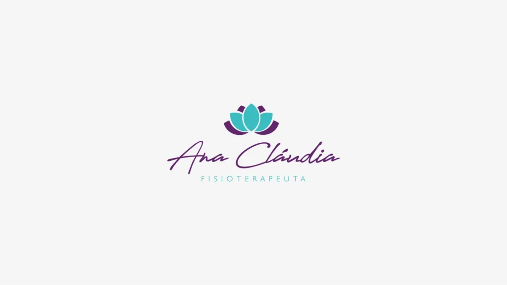
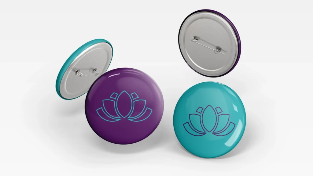
The answer came from a single image: the lotus flower.
It’s not decoration. It’s a precise metaphor. The lotus blooms even as it rises from the mud, much like the rehabilitation process: the patient moves through difficulty to reclaim what is theirs, their quality of life, their body functioning again. The flower isn’t an ornament. It’s a summary of Ana Cláudia’s work.
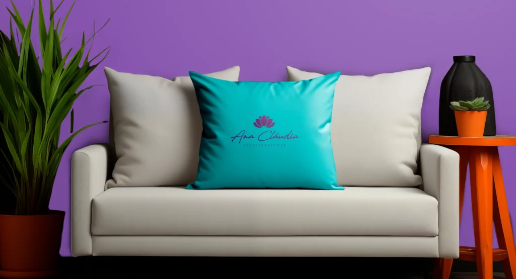
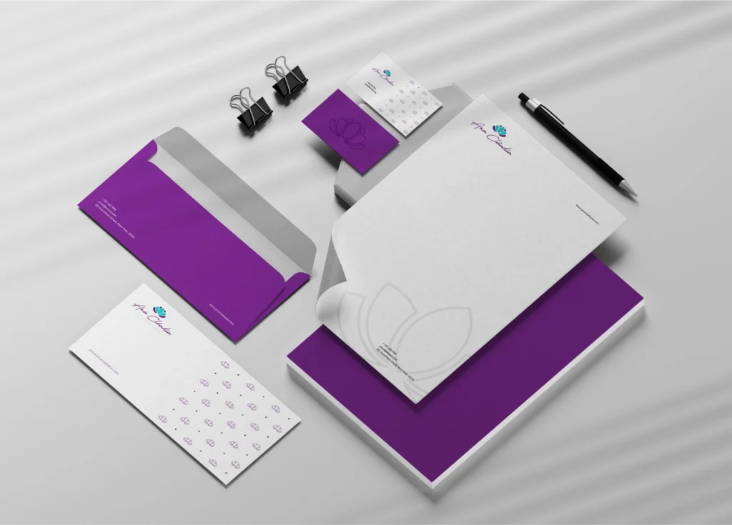
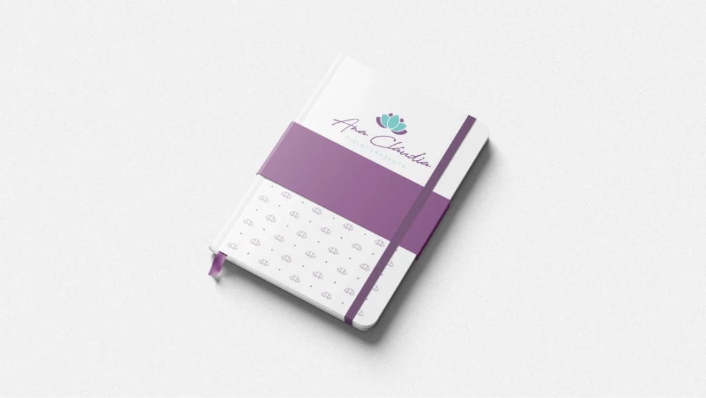
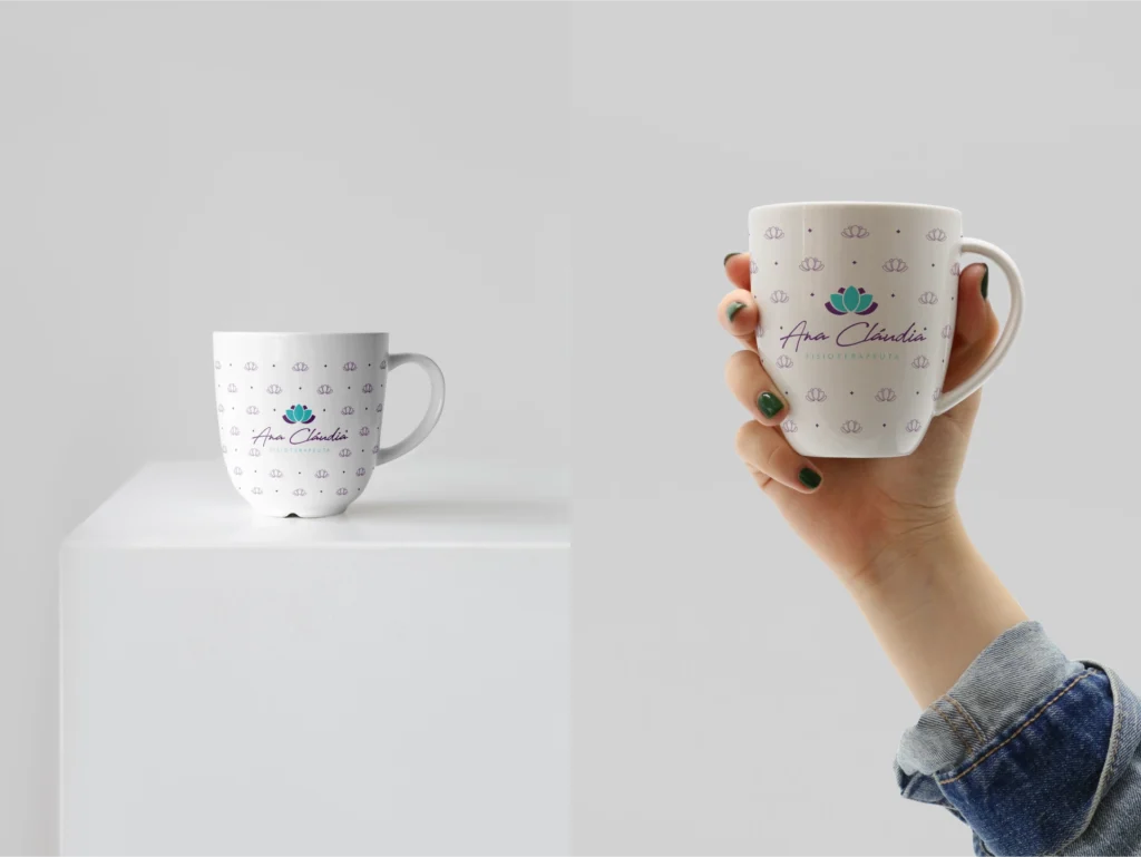
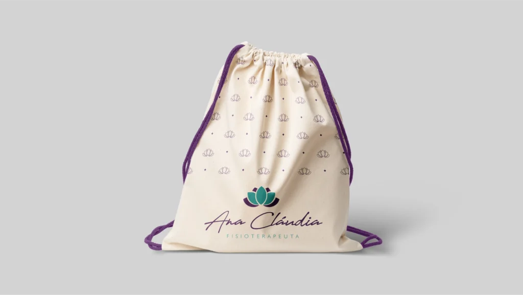
The symbol is built from geometric, symmetrical petals, with a turquoise central petal as its axis. The composition feels like a flower unfolding, not a flower already in full bloom. That matters: the process is the point, not the final result. Turquoise brings health and calm; purple brings sophistication and balance. Two colors, one tension: technical care with a delicate presence.
A brand with both body and soul. Neither one gives way to the other.