The Challenge
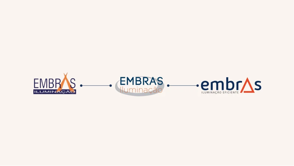
Embras is all about one thing: making genuinely good lighting fixtures, without distractions. But the old brand didn’t tell that story. It was generic and dated. It looked like any other company, not a specialist obsessed with constantly improving its products. The identity didn’t reflect the technical level of what the company actually delivers.
The Concept
There was no need to overcomplicate it: the brand needed to look like what the company already is. Solid, efficient, focused. That meant leaving the generic behind and building a lighter, more sophisticated aesthetic, without losing the substance of a company that works with technical products and never compromises on quality.
Color and typography play a specific role: communicating clarity and professionalism without making the brand feel old or stuck in the past. It’s a brand grounded in production and looking toward the future, modern without chasing trends, reliable without feeling rigid.
Because customers looking for high-quality solutions don’t trust companies that seem careless about their own image.
What We Delivered
- Visual Identity Redesign
- Logo and symbol
- Color Palette
- Typography
- Supporting Graphic Elements
- Application Guidelines
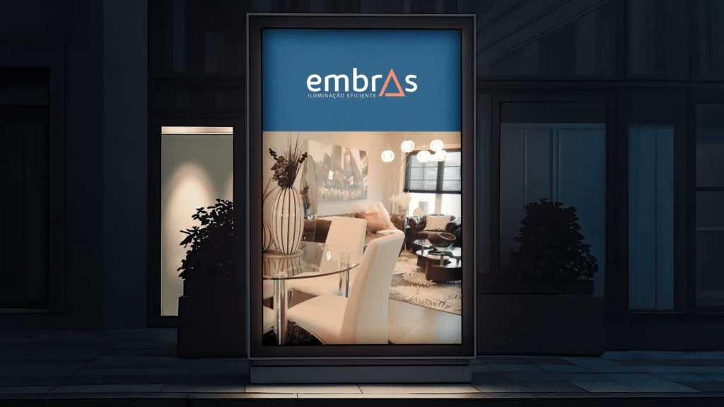
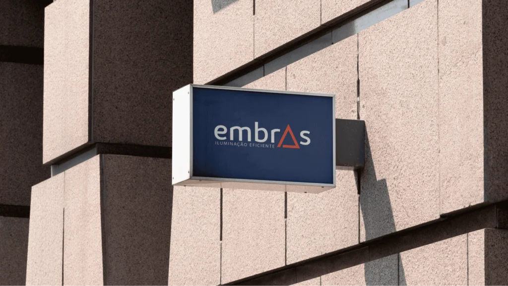
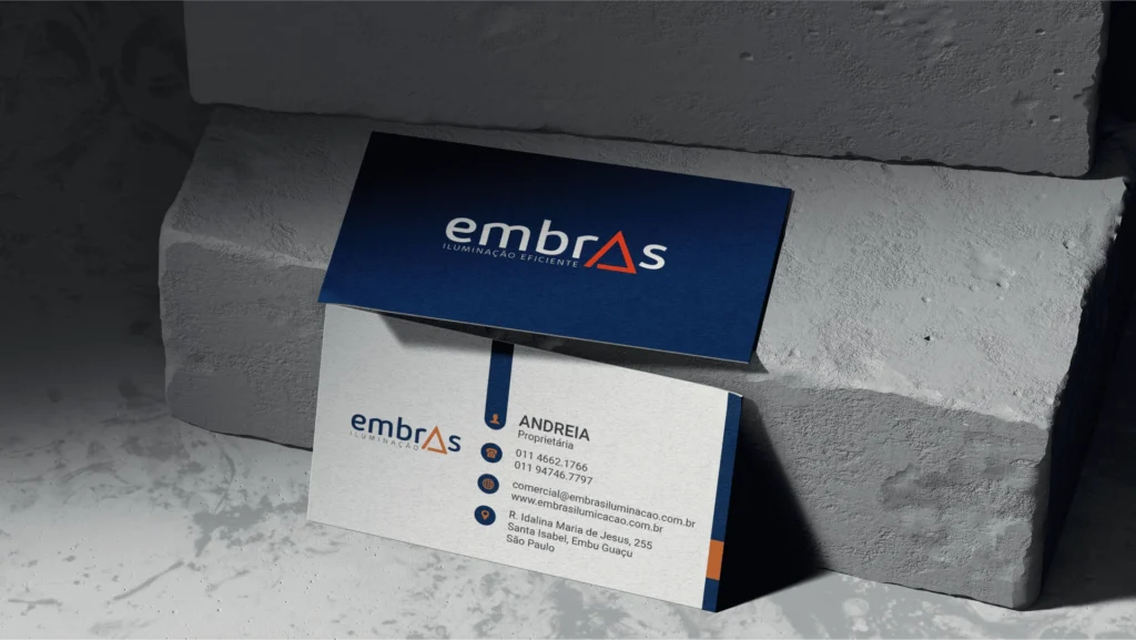
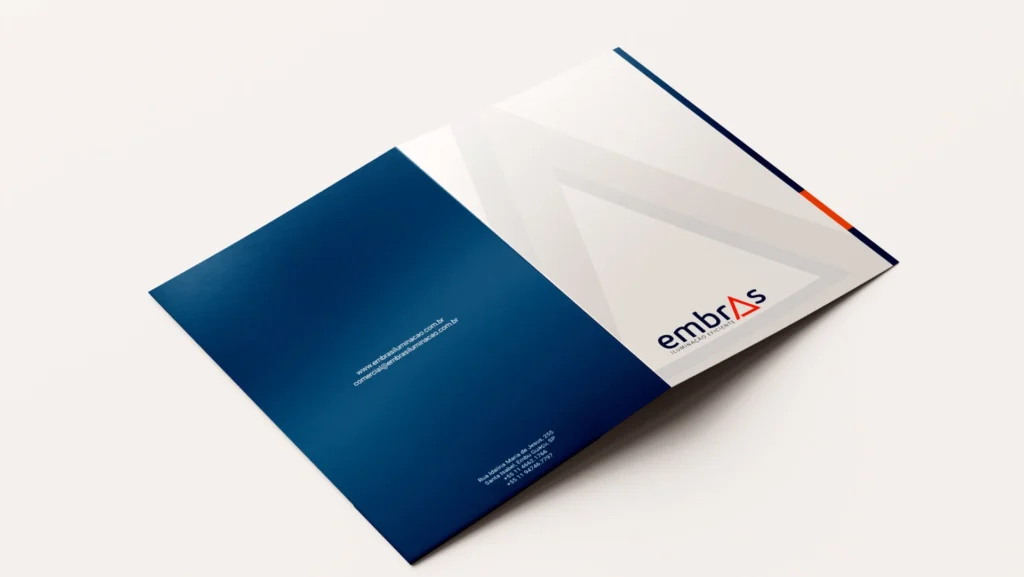
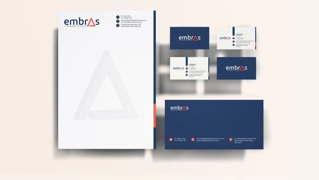
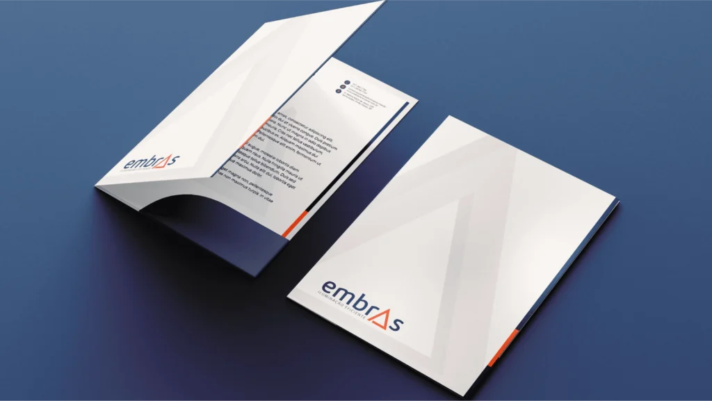
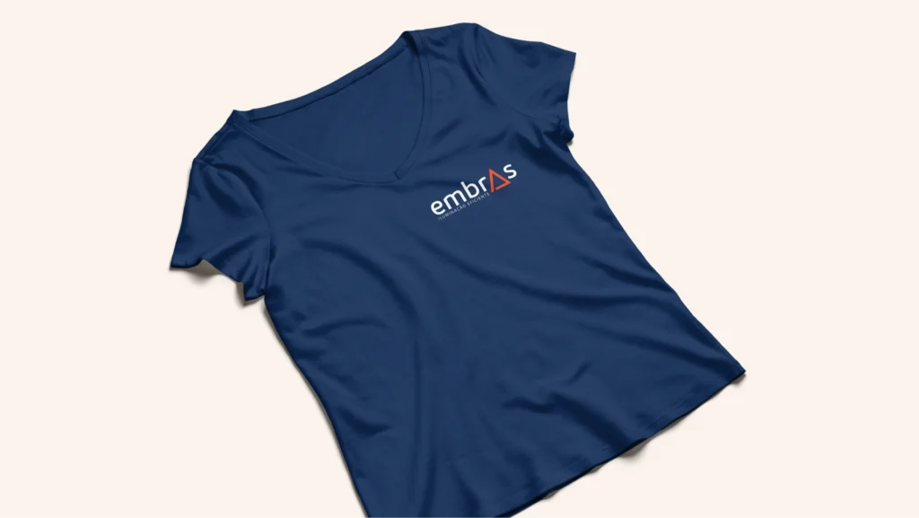
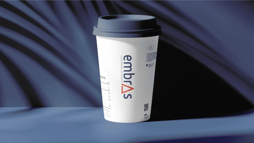
- Branded Materials and Communication Assets
The result: a brand that looks exactly like what Embras is: solid, modern, and committed to excellence in everything it produces.