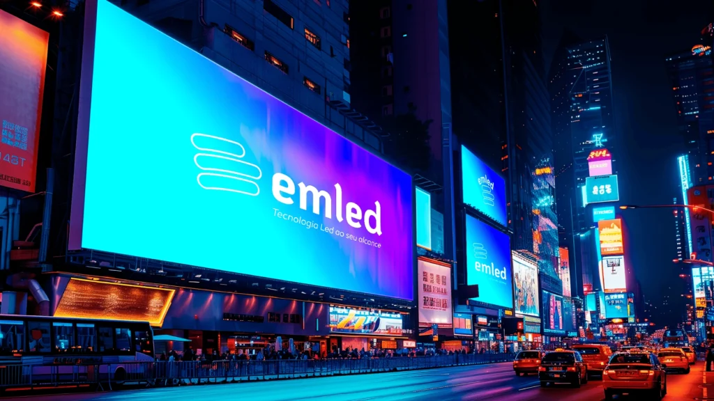
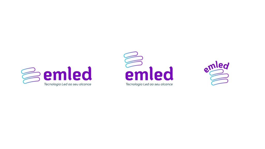
The Challenge
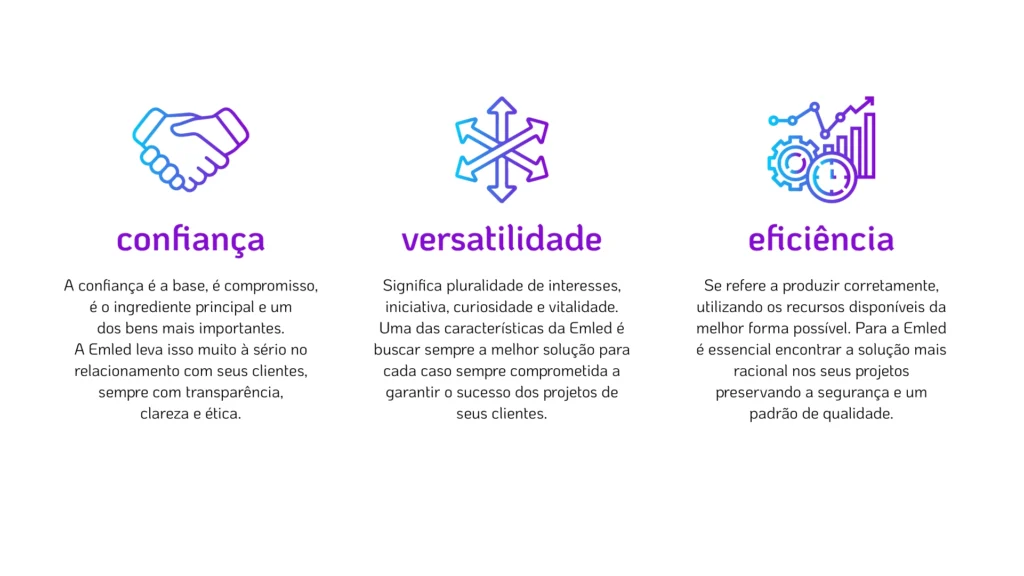
The LED technology industry is technical, competitive, and crowded with companies making the same promises. Emled needed a brand that wasn’t just another empty promise. It needed to demonstrate, through its identity, the three pillars that truly drive the business: trust, versatility, and efficiency. It wasn’t enough to say it. The brand had to look like it.
The Concept
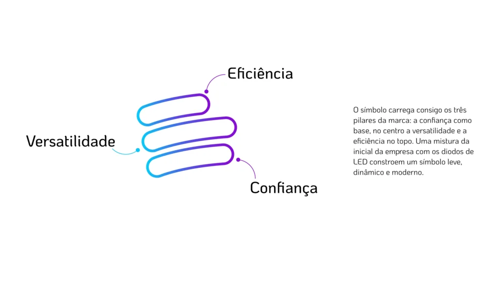
Trust isn’t something you decorate. It’s something you build. That’s why the identity was designed to communicate transparency from the start, without unnecessary decoration or vague promises. It’s a brand that immediately says: you know who you’re dealing with.
Versatility came through dynamic design. Emled doesn’t deliver rigid, one-size-fits-all solutions. It delivers what each project requires. The brand needed that same movement, that same ability to adapt without losing its identity.
And efficiency, the pillar that holds everything together, became a clean, modern aesthetic with nothing unnecessary. Nothing extra, nothing accidental. A company that optimizes technical resources can’t have a cluttered brand saying otherwise.
A clear, straightforward brand with nothing hidden in the fine print. That’s technical commitment turned into visual language.
What We Delivered
- Visual Identity
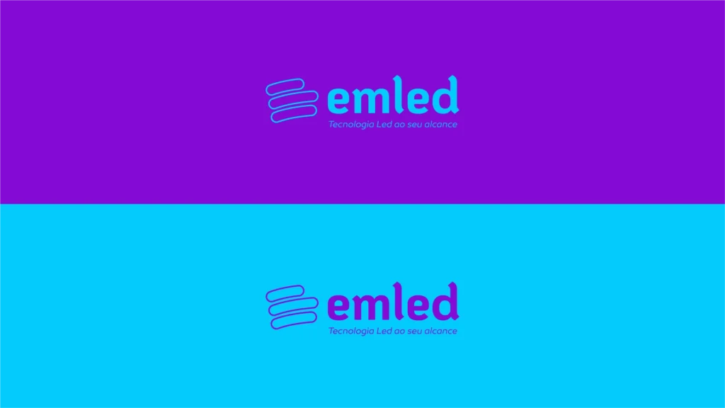
- Logo and symbol
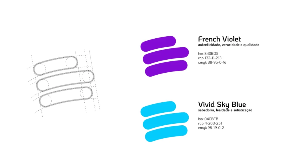
- Color Palette
- Typography
- Supporting Graphic Elements
- Application Guidelines
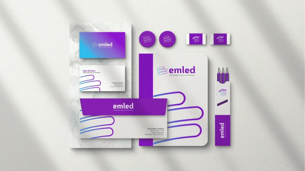
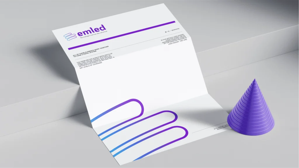
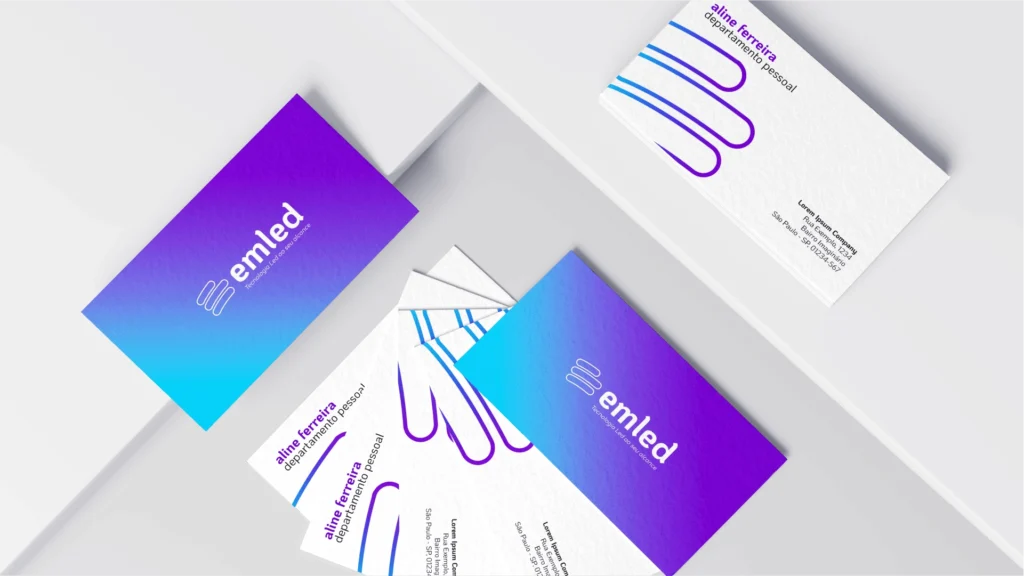
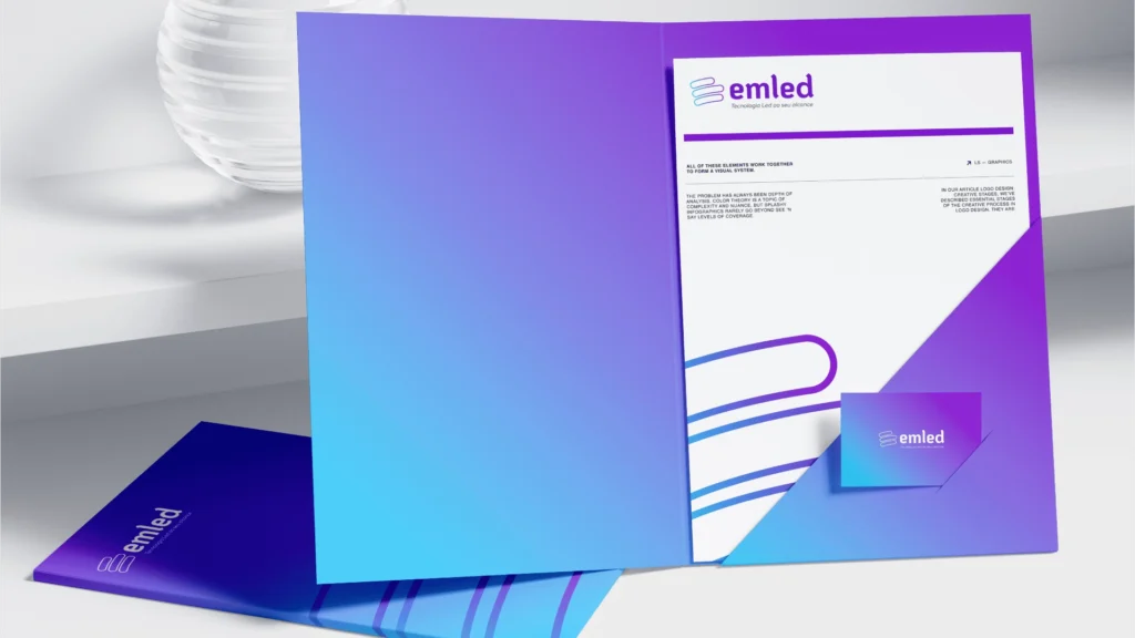
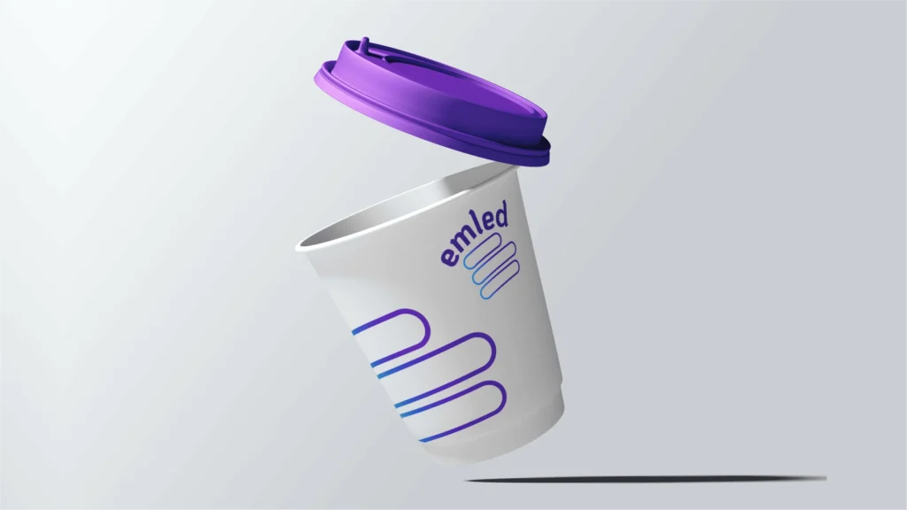
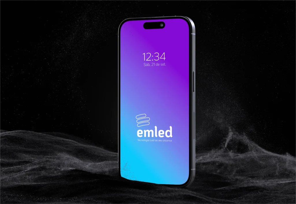
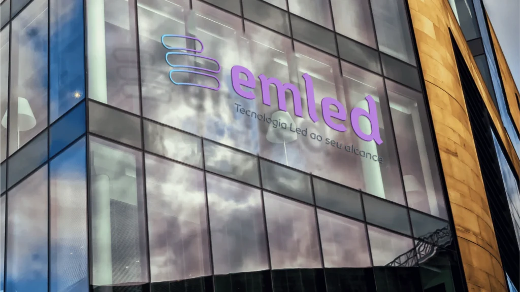
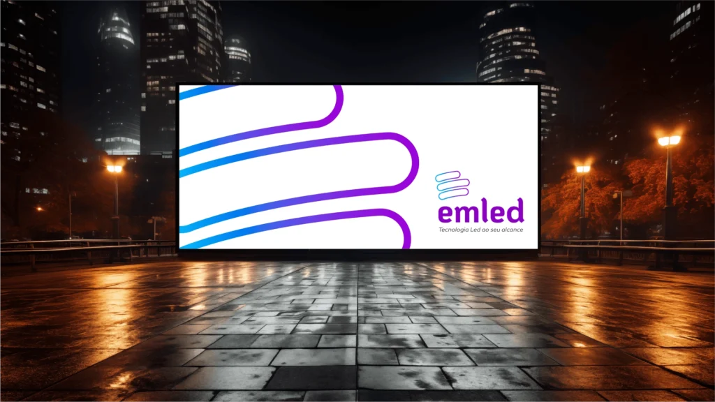
- Branded Materials and Communication Assets
The result: a brand that visually delivers what Emled already delivers in practice: trust, adaptability, and technical efficiency.